Katie Ridder Bedrooms
Skip to content
My local independent bookstore, Barrett's, asked if I would write the design book reviews for their holiday newsletter again this year. As I am thrilled to have a brick and mortar location nearby where I can actually look and feel before I buy, I of course happily agreed. As always, there are many tempting volumes this season but as soon as I opened Katie Ridder Rooms I knew it was something special.

As a former publishing art director, I appreciate when the actual production of a book is as beautiful as the designs it features. Many are attractive with fabulous photographs but very few show the attention to detail that this volume does. Each chapter opening is color coordinated with both the type and a charming related Katie Ridder-style graphic. Take for example the title page and the opening photo of this spectacular dining room.

 Or the double page spread (shown here vertically) for the section on Studies and Family Rooms


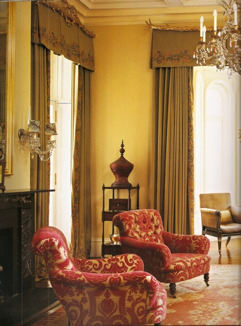
My vertical presentation does not do justice to the stunning double page layout. And it is this same attention to detail, these thoughtful but important touches that sets Ridder's work apart. I adore that she seeks out master artisans to collaborate with. Take, for example, the work in this Virginia horse country living room. The valance is crowned by reproductions Ridder commissioned of antique gilded-wood branches. And the wool sateen curtains are embroidered with berries, twigs and leaves by specialty house Penn and Fletcher. The woodland theme then continues with a leaf pattern on the custom lampshades, not visible in this photo.

There's something about Ridder's unique design vision that is totally addictive. Perhaps it's her combination of sophistication and practicality or her distinctive color combinations but Katie Ridder's rooms radiate an upbeat livable style that is appealing to a wide range of tastes. I practically gasped when I opened to the symphony of orange in this fabulous foyer in the same home.
 The antique furnishings support the grandeur of this 19th century Italianate house and yet it still feels fresh and vibrant,

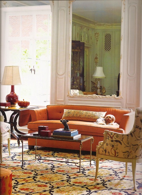
as does this living room where the modern shape of the linen covered sofa (yes, orange again) is paired with period chairs recovered in a classic Robert Kime linen.
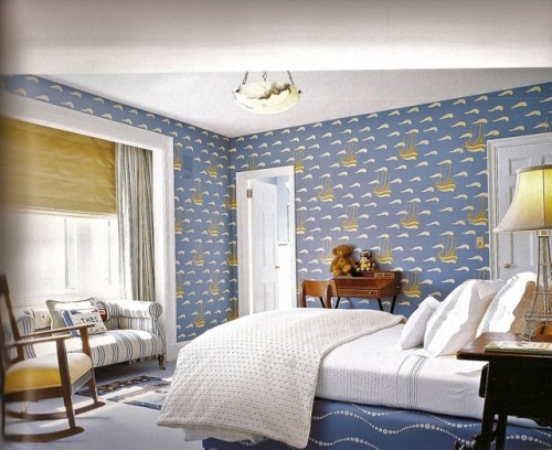
 Organized by rooms, her innovative ideas are laid out with easy accessibility. Two bedrooms show how color and pattern can be both lively and serene. In a NYC apartment, the boy's bedroom above overlooks the East River, inspiring the theme. It's so clever how the waves on the box spring (which also appear on the headboard) echo the sea faring pattern of the hand stenciled walls.
 In a Hamptons bedroom above, the bold pattern of the Scalamandré silk ikat curtains is kept in check by the painted beadboard.
 Even a small space like this Arkansas house bar deserved detailed attention. How fabulous is the glass and nickel shelving against that silver-on-peacock Japanese Floral wallpaper by Florence Broadhurst. Such an unexpected yet successful combination.
 In addition to the beautiful designs and principal photography by Eric Piasecki, Katie Ridder Rooms is brimming with useful tidbits from "Anatomy of a Full-Length Curtain" to "The Ideal Dining Chair." Featuring an extensive list of sources and a chapter on Ridder's signature details, such as her use of embroidery shown above, this book is a must have for any design library.
Source: https://quintessenceblog.com/katie-ridder-rooms/


Tidak ada komentar:
Posting Komentar